- Organize a page according to the rule of thirds!
- A grid system allows the mind to comprehend better.
- Don't be afraid of white space.
- Asymmetry is usually good.
Define
Heuristic Evaluation
Brand
- Look + Feel
- Typography
Design
Architecture (comes first)
Design (Photoshop, etc)
Copywriting
'Informational Hierarchy' must be taken into consideration when working on a website. This means having a focal point when a person lands on the website. This helps a user's eyes trail through the layout.
____________
Graphic Design Principles:
Avoid C.R.A.P
Contrast - is the most visual attraction on the page so go for bold contrasts. Avoid blending elements that are similar but if they are similar, then make them different (such as color, size, spacing, etc).
Repetition - creates organization and unity across the design when there's repeat color, shape, texture, spatial relationships, line thickness, size and typeface.
Alignment - align objects over all with other objects to a defined edge. Every item should have a visual connection with something else on the page and the elements should line up (adds to readability and cohesiveness).
Proximity - group related items together because proximity or closeness implies a relationship but visually separate groups. In this website, proximity is not managed well. You can't figure out what to read first.
Color:
Yellow and Blue work well as school colors because they are complimentary colors. Color Scheme Designer can help bring together colors for a website, including a third color that can work well with the first two. The designer allows people to see their chosen colors on a layout page and view their colors through the perspective of people with vision issues, such as color blind. This allows a designer to take color choices into consideration.
Workflow Process:
Define will include design statement, a vision board and a creative brief.
The Design part will include a mock-up and site structure.
The Build phase will include XHTML and CSS.
Wednesday, January 25, 2012
Friday, January 20, 2012
Heuristic Evaluation
In regards to a user interface design, a tester can use the evaluation method to improve a site's usability and find any possible problems.
1. Visibility of System Status
Once at the site, you know where you are on website and where you can go next. If you're hovering over the menu bar and colors appear, that tells you the site is active.
2. Match Between System and Real World
System speaks in a language user understands.
3. User Control and Freedom
You can make choices on the website such as leaving site if you wanted to.
4. Consistency and Standards
Navigation bar remains in place as you jump pages.
5. Error Prevention
404 Page Not Found includes Home Link to take you back or Site Map
6. Recognition Rather than Recall
Use universal symbols; red = STOP
7. Flexibility and Ease of Use
Site can cater to inexperienced and experienced users
8. Aesthetics and Minimalist Design
Site simple, easy to use and contains relevant information
9. Help Users Recognize, Diagnose, and Recover from Errors
Error messages easy to understand, indicate problem and suggest possible solution
10. Help and Documentation
Just in case a user needs help or step-by-step instructions
Class Example used this website for a heuristic evaluation. One of the criticisms found was that a campus directory should be provided under Quick Links.
Homework: pick a website that you can criticize well, such as "Where's contact information?" Complete a heuristic evaluation and make suggestions as to how the site can be improved; include a screenshot of website you choose
Tuesday, January 17, 2012
Process
Define Requirements, understand, audience objectives, creative brief
Design Architecture, copywriting and visual design, user testing
Build Code, usability testing, QA, launch
Maintain Marketing and communications plans
About Me
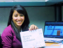
Hi! I'm Shae. As a young imaginative child I wanted to buy Cartoon Network and be a cartoon. Since then I've learned being a penguin won't exactly pay all the bills. So here's me in a nutshell:
Academic Studies:
- Major: Electronic Media and Visual Communications
- Minor: Marketing
- Certification: Public Relations
Extracurricular Activities and Interests:
- University blogger and Orientation Leader at UM-D for 3 years
- Mixed Martial Arts, Kickboxing, International Black Belt Club
- Doodling, video games, dance, writing, cooking, baking
Future Aspirations
- MBA in Marketing
- Launch a brand
- Be creative director for an animation company
- Write a few books
- Own a Range Rover Sport
My idea for a final project is to move my existing student web portfolio onto a better website that can be customized to my liking with links to my LinkedIn, Twitter, etc.
About Me
- Shae Khan
- Hi. I'm Shae. You have landed on a blog for one of my classes at the University of Michigan - Dearborn. Happy reading!